Who doesn’t love donuts? When a fellow exhibitor at a big conference and trade show this past spring suggested we use donuts to lure attendees to our booth, I was all in.
Next day, I was armed with a couple dozen. The move (we dubbed it the Dunkin’ Draw) was inspired by a woeful lack of passersby on the first day. Why? Because, along with just a handful of other exhibitors, we had been allocated to a side room off the main exhibition hall. Granted, that room was used to serve lunch later in the day, but most attendees didn’t realize we were in the space until they came through for their complementary turkey wraps and jumbo cookies. And at that point their objective was eating, not learning about potential vendor or partner services.
It was frustrating, and I implored conference organizers to call attention to our isolated annex as best they could. Some impromptu extra signage and text alerts helped, but being out of the event’s organic flow still proved to be a killer.
While the Dunkin’ Draw helped bring a few more people to our booth, I still had spare time at the event. When I wasn’t discussing Street Level Studio’s marketing capabilities with attendees, I started thinking about all the reasons why good design and great signage are key to making sure everyone at a conference, tradeshow, or convention has a positive experience.
Designing for Direction
Having worked—both individually and together—with a wide variety of organizations involved in planning conferences and tradeshows, the Street Level Studio (SLS) team has collectively spent hundreds of hours helping attendees and exhibitors find their way to that positive experience. We unanimously agree on this: visual distractions are rampant in vast convention centers and on tradeshow floors, and there’s nothing worse than wandering in with no clear idea of where to go.
That’s why we share some critical design and communication advice with all of our clients hosting professional events—whether they’re global corporations or nonprofits, associations, or entrepreneurial companies. Here it is: having well-planned, thoughtfully designed, and strategically placed wayfinding signage not only minimizes confusion and frustration, but it also makes the visual experience of any event more immersive and successful.
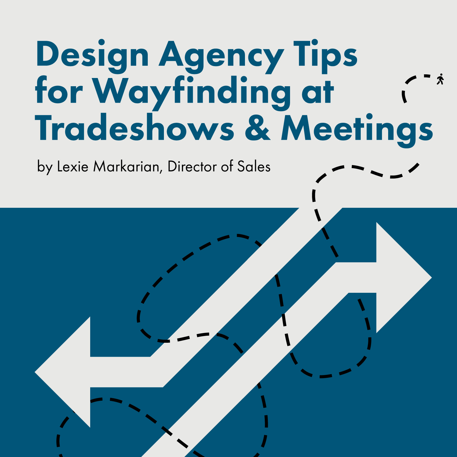
Here are some of our best tips on designing for direction:
Be Proactive: Envision traffic patterns, potential bottlenecks, and prime locations—registration, meeting rooms, restrooms, dining facilities, lounges, quiet work areas, etc.—well in advance, and map out your wayfinding strategy accordingly. Also make sure to anticipate attendees’ questions. While all those new custom conference apps are great, don’t make people keep pulling out their phones to find the information they need.
Stay Simple: Make intentional design choices around fonts and colors. Keep copy concise and messaging consistent and easy to read even from a distance. Use universal symbols for international visitors who might struggle with the language.
Pick Your Spot: Display signs and graphics where they will be most useful and easy to find, especially in those high-traffic areas where there is more than one direction people can go.
Go Big: Understated venue signage that’s designed to blend into the walls at meeting room doorways or restroom facilities are easily overlooked. It’s the same for any other informational signage. Large is the way to go!
Go High: Banners mounted or suspended overhead are a lot harder to miss than signs and graphics haphazardly displayed at eye-level on walls, tables, and easels.
Go Vertical: In busy, crowded spaces like a tradeshow floor, maximize limited space with vertical signage, from tall pop-up banners to towers that rise above the crowds.
Be Original: Look for unusual opportunities to help people navigate their way through your event. Think removable floor graphics, window banners, elevator wraps, branded tabletops, stair graphics, etc.
Create a Code: Consider color-coding various types of signs and banners to designate different activities or destinations or to make it easier for tradeshow visitors to find the type of vendors that interest them.
Be Ubiquitous: Don’t be afraid of repeating information. In this kind of setting, it’s preferable to overcommunicate than to have people wandering and wondering where to go.
The Way Forward
Not being in the main exhibit hall at that expo was the source of frustration prompting this post—and I still wish more attendees had realized there was another exhibit space and we were there to meet them. But the moral of that story is clear.
Focus on the purpose, placement, and design of on-site graphics at your next event, because it literally makes it possible for everyone to get the most out of coming together to share knowledge, make connections, and do business. And everyone there will feel—and benefit from—the attention you put into every detail. Even more important, thoughtfully designed directional signage will reinforce that your association or business organization was the force behind a great experience.
If you need high quality signs, graphics, or banners for an event, the Street Level Studio design team has the expertise, nimble execution, and efficient production skills—plus access to leading printing solution providers—to help you take your event and the people who attend it in the right direction. Of course, no one will mind if there are donuts involved somewhere too!
Lexie Markarian is Street Level Studio’s Director of Sales.
