What’s in a (Color) Name?
Every color tells a story, and each of the roughly ten million colors that are visible to the human eye conveys a message by producing a chemical reaction in our brains. These messages are often tied to emotional responses, personal memories, and cultural context. They can impact our perception—when you assume that a yellow car on a city street is a taxi—and they can cause us to act—when that same taxi stops at a red light.
So, what happens when we boost this communication by giving the colors names? By adding in language, can we craft these messages and reframe these perceptions?
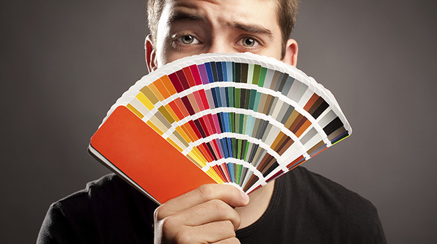
If you’ve ever opened a package of crayons, purchased a lipstick, or perused paint chips, you’re familiar with color names that fall out of the standard ROY G. BIV spectrum. These names hold a great deal of power, first and foremost, the ability to offer a fuller description of a particular color.
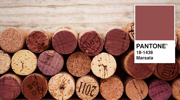
Pantone, the authority on color trends, chooses one “Color of the Year” to express the visual spirit of the year and to predict future trends. According to Pantone, the 2015 color “embodies the satisfying richness of a fulfilling meal while its grounding red-brown roots emanate a sophisticated, natural earthiness… [It is]…an earthy shade with a bit of sophistication… A matte finish highlights [its] organic nature while adding a sheen conveys a completely different message of glamour and luxury.” That’s a big message for one color to convey. Pantone has chosen the name “Marsala” from a wine originating in Sicily to perfectly encapsulate this meaning.
However, the most descriptive name isn’t always the most beneficial. According to Help Scout citing this study, “when subjects were asked to evaluate products with different color names…‘fancy’ names were preferred far more often. For example, mocha was found to be significantly more likeable than brown—despite the fact that the researchers showed subjects the same color!” This may even extend to purchasing power; for example, “It has also been shown that more unusual and unique color names can increase the intent to purchase. For instance, jelly beans with names such as razzmatazz were more likely to be chosen than jelly beans names such as lemon yellow.” Thus, with the right color name, marketers can affect product appeal and even user choice.
Color is integral to the following companies’ brands, and the names of these iconic colors have played a unique role in their marketing and history.
UPS — Choosing their trademark color “Pullman Brown” was a strategic move for UPS in 1916. According to Big Brown: The Untold Story of UPS, not only did the color resist harsh weather when painted on delivery trucks, but it also symbolized Pullman, a popular railroad sleeper-car manufacturer, and the respected railroad industry. The color represented reliability and stability to users, and it aligned with the UPS brand promise. It was even the focus of the brand’s former tagline, “What can brown do for you?”

Tiffany & Co. — Tiffany & Co. crafted and developed the meaning of its signature color over time. First seen in the 1878 Tiffany’s Blue Book catalog, this turquoise blue has traditionally represented communication and creativity. However, through consistent branding, this color has evolved to represent style and sophistication, and it has become an iconic symbol of the company. It is now a registered trademark and is widely recognized as “Tiffany Blue.”
The power behind each color name is undeniable. Cast your vote below for your favorite name for each color. What appeals to you about each name?
the Blush
