Did Helvetica Just Get Lucky?
Back in 2015, we posted a tribute to typeface designer Adrian Frutiger on the occasion of his death. Guess what? It’s still one of our most-read blog posts nearly four years later. Obviously, the fascination with font design continues.
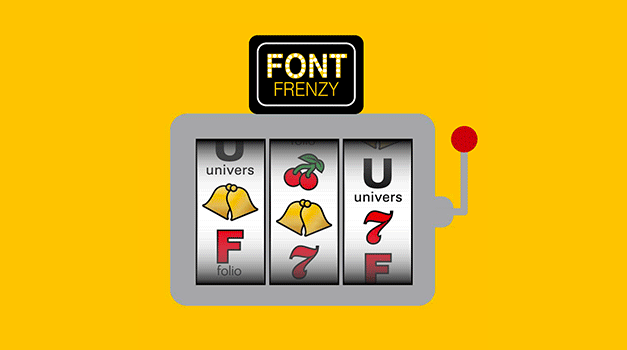
Case in point, a recent article on Printmag.com by Paul Shaw took a “what if” look at Helvetica’s rise to “typographic celebrity,” riffing on the question, “How did it get thereÉand why didn’t Univers get the spotlight instead?”
According to Shaw, there were several lucky and serendipitous turning points in Helvetica’s journey to becoming a household name—pretty much all of them revolving around business decisions and technology developments rather than design aesthetics or the font’s intrinsic superiority. Had things gone a different way, who knows what font you’d be seeing on posters at the post office, your IRS tax forms, NASA orbiters, or the labels on American Apparel?
Street Level Studio’s creative director Grogg is a self-proclaimed type junkie, always looking for hidden type treasures everywhere. His take on Helvetica? “It’s become so ubiquitous it’s hard to imagine our graphic world without Helvetica. With some designers, it’s reached a fatigue level, but no one can dispute the sheer practicality and minimalist beauty of it.”
Shaw might disagree. Here’s a link to “The Univers of Helvetica: A Tale of Two Typefaces.” It’s the “type” of content that’s definitely worth reading!
