All That Glitters—A Lesson in Color Control
Understanding color and color management is a critical component of digital design and printing, and it doesn’t just happen at the press. Getting the desired color outcome starts with the idea itself, continues through the design process, is controlled at the prepress stage, and is dependent on the ink and paper used. So, the more color knowledge you have as a designer, the easier it is to bring your visions to life.
Lately, our senior designer Chris Gach has been learning a lot about the color gold. And his education proves the familiar phrase “all that glitters is not gold” is even more accurate than you might imagine.
Accepting a colorful challenge
It all started when we received a challenging commission for our Beyond the Surface™ bespoke wallcoverings from Street Level Studio.
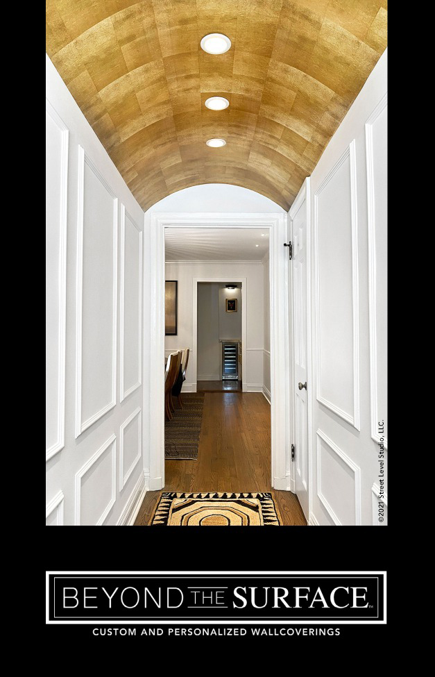
Hoping to emphasize a stunning barrel-vaulted ceiling in a small entry hall, Chicago-area interior designer Dana Roeser found inspiration in the centuries-old churches and basilicas where this soaring architectural feature originated—often gilded with precious metals to draw the eyes upward.
Gilding, the art of applying very thin sheets of gold or silver leaf to a surface, has been used throughout history to create a lustrous finish that accentuates architectural details and craftsmanship. Dana wanted to replicate the beautiful, burnished look of classic gilded arches and domes—but without the extravagant cost of using real gold leaf.
She tried searching for the perfect wallpaper from traditional, high-quality wallcoverings companies, but the effort proved fruitless. The closest option from one premium resource—a patchwork of brassy gold and bronzed black squares—lacked the aged patina, subtle shimmer, and artisanal touch Dana envisioned and was well over budget. Her insistence on finding a more creative and cost-effective solution, however, paid off when she discovered our personalized, digitally designed and printed alternative.
Applying the gold standard
With gilding, creating the desired effect requires the hand of a skilled and experienced artisan. The same can be said for any surface designer endeavoring to reinterpret this age-old technique using digital technology, paper, and ink. To achieve the hyper-realism of Dana’s vision, Chris knew the solution wasn’t going to be as simple as printing a pattern with gold metallic ink.
He began by creating a digital tile grid based on the standard size of a sheet of gold leaf (5.5″ x 5.5″) and proportioned to fit the exact curve of the vaulted ceiling and the location of the hall’s light fixtures. To recreate the fragility and irregularities of a torn sheet of gold leaf, each tile edge was then meticulously scalloped and roughened to avoid any sharp lines.
When it came time to digitally “gild” the individual tiles, the learning curve got a bit steeper. Millimeters thin, a sheet of gold leaf can both reflect and transmit light, which means the quality of the burnishing technique used can influence the visual appearance of a gilded surface. To authentically reflect varying levels of light, some areas of gold on each tile had to be drawn in darker, some lighter.
Achieving a brilliant result
Finally, Chris manipulated the tiles within the grid to mimic slightly overlapping sheets of vintage gold leaf, carefully positioning them in relation to each other and factoring in the hall’s limited light sources. Here, another lesson came into play: context. Chris realized gold reflects differently if you are looking down at it or looking up at it. The color also takes on different hues as you move it, expose it to different light sources, and even when you place different shades of gold next to each other. Adjusting for these variations on a computer screen required some tricks. Accommodating them in the actual hallway required a few more.
Since the hall had very little natural light, the final challenge was selecting the right paper to reflect the subtle shimmer and patina once the wallpaper was installed. After experimenting with a variety of traditional media and finishing options—as well as taping samples to different ceilings and lying on the floor to look at them—Chris decided to go with a specialty paper, DreamScape® Satara Pearl, for the project.
It was the ideal choice. Printed using the latest large format production inkjet technology, the paper’s pearlescence delivers the desired gilded effect—allowing the wallpaper to dynamically reflect light as you move through the space. It draws the eye up, makes the barrel-vaulted ceiling a true focal point, and sets a dramatic stage for entering the elegant apartment. Exactly the effect Dana envisioned.
Going above and beyond
Once again, Chris and the Street Level Studio team went above (literally!) and beyond to solve a unique design problem and deliver on a client’s vision. So, if you have questions about color control, face a tough design challenge, or want to customize your space with personalized or branded wallcoverings, be sure to look us up!
