Adjust your marketing strategy to meet changing trends in technology. Mobile device growth is exploding worldwide as people now shop and gather information from a variety of portable devices. Having a website that is not mobile-friendly is now no longer an option.
A responsive website automatically resizes and formats content to look great on all devices, including smartphones, tablets, laptops, desktops, smart TVs, and many more. All with one website! A website with responsive design accounts for all screen sizes so mobile users don’t get lost in “pinch-and-zoom” trying to navigate a desktop website on a mobile device. And responsive websites are mobile-friendly, which has now become an important factor in Google’s ranking of web pages in mobile search results.

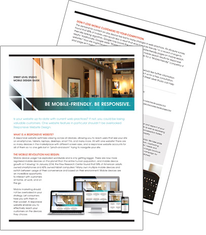
A responsive website automatically resizes and formats to look great on all devices.
Being mobile-friendly is essential for reaching your customers today. Our team of designers and developers can help you get there.
See How to Integrate Responsive Website Design into Your Mobile Website Strategy.
Download the Be Responsive mobile design guide for more information on trends that affect your mobile marketing strategy.
