Media-Agnostic Marketing Design: Size Doesn’t Matter
For graphic designers, a sizable challenge is creating marketing campaigns that are media-agnostic. The visual elements have to be both consistent and elastic—as recognizable and prominent on a mobile screen or direct mail flyer as on a roadside billboard. It’s a big ask that encompasses more than just scale or proportion—especially as the number and type of potential platforms for reaching target audiences continues to explode.
Going 10 Feet Tall
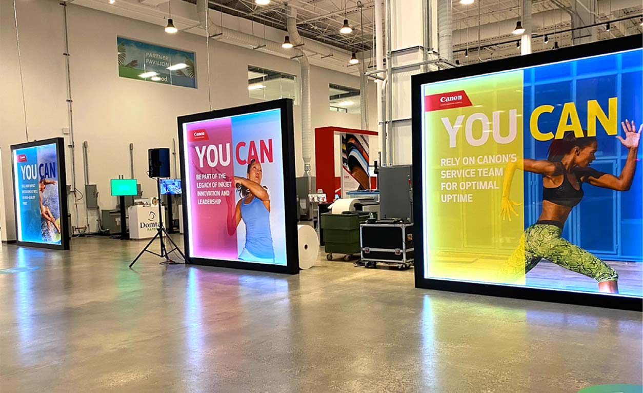
Creating designs that are media-agnostic is just the kind of challenge we thrive on at Street Level Studio. Recently, we were tasked with adapting the award-winning “You Can” campaign we created for client Canon Solutions America for a series of outsized environmental graphics at the company’s new Canon Americas Customer Innovation Center (CIC) in Boca Raton, FL.
So far, we’ve demonstrated the agility of this popular marketing campaign across a wide range of media—from print ads and magazine onserts to all kinds of digital advertising, segmented email campaigns, custom landing pages, direct mail, and video—earning industry attention and accolades in the process. But for this project, our creative team was challenged to stretch the campaign’s visual identity even further. The job called for four 10 ft. by 10 ft. signs to frame the entrance to the section of the Customer Innovation Center where Canon’s impressive production printing presses are set up, plugged in, and ready to run live printing demos.
Delivering the Big Picture
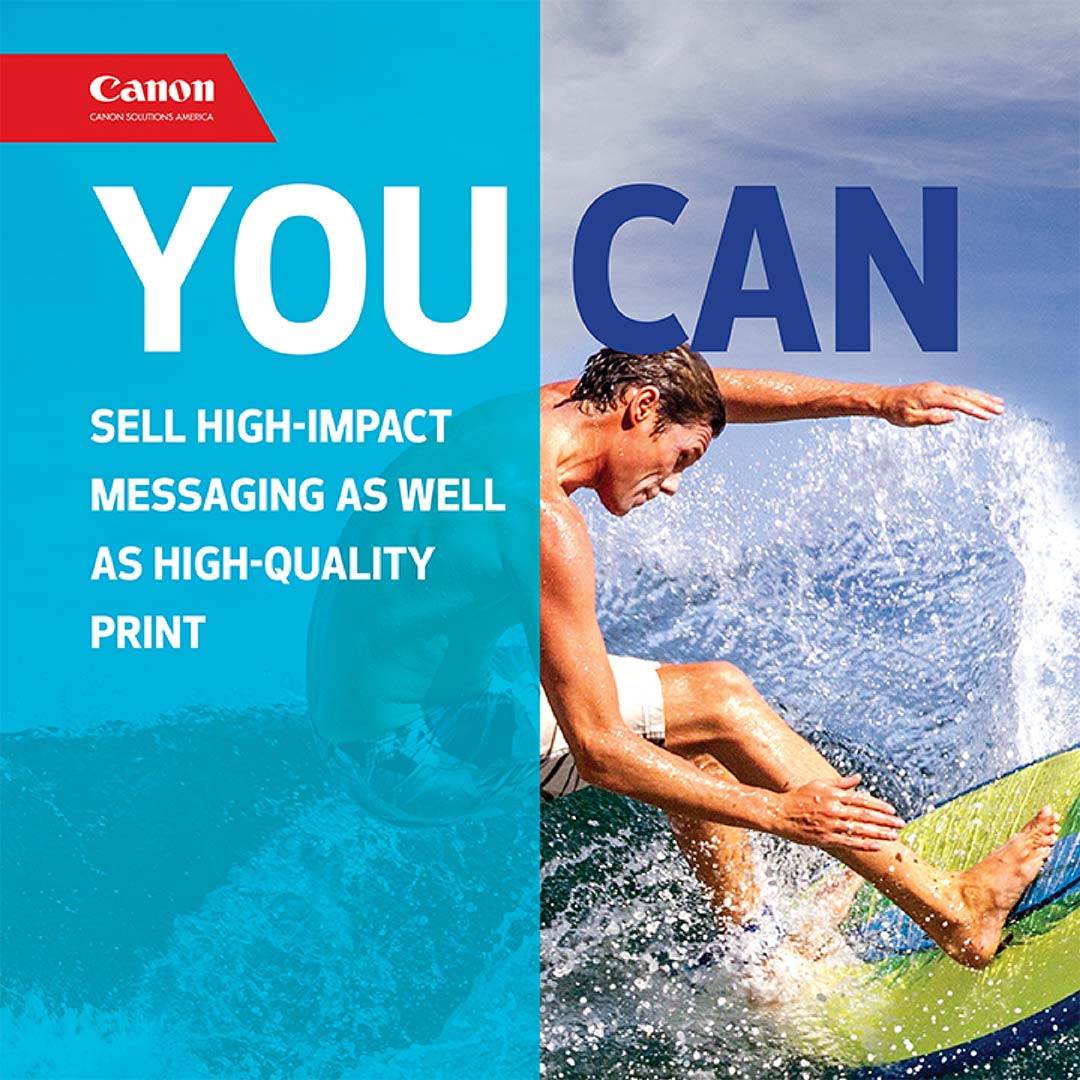
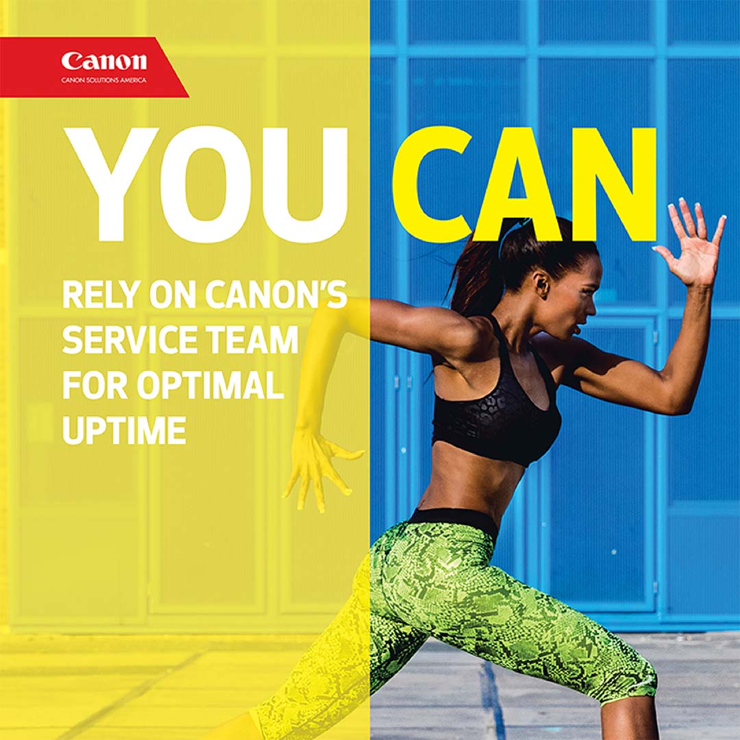
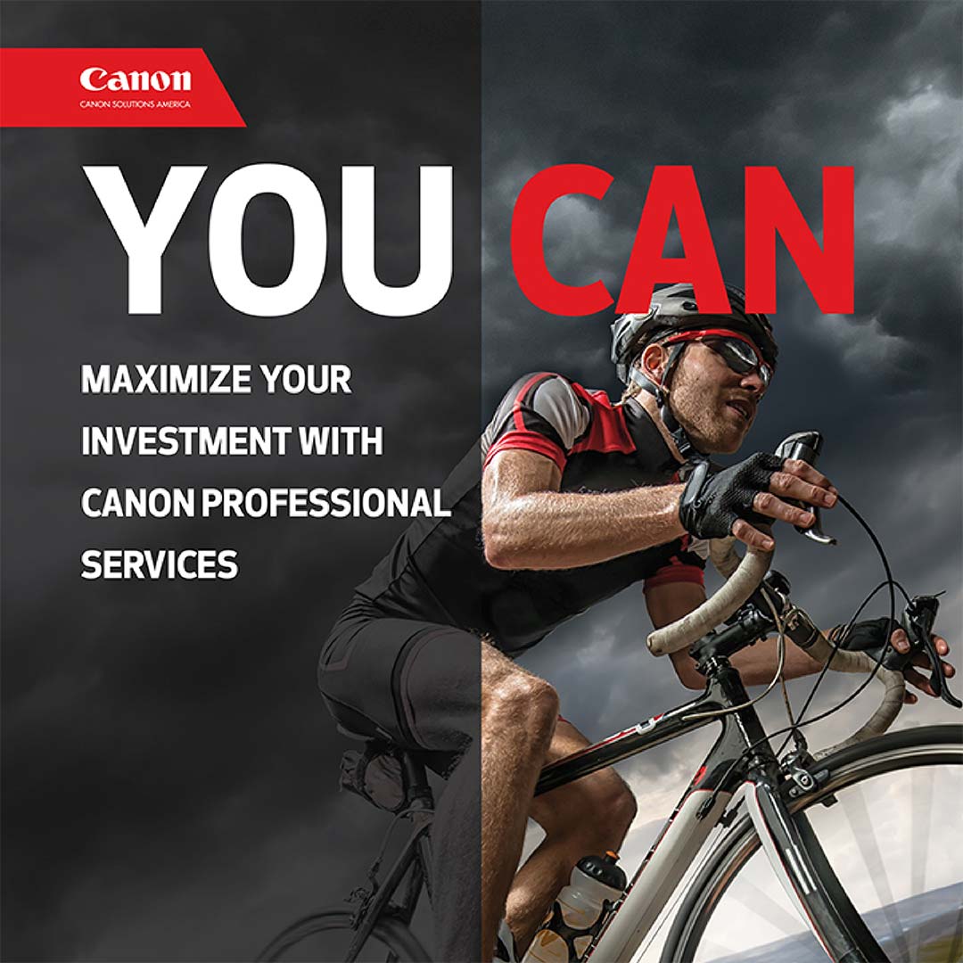
Our senior designer Chris worked with the client’s production team to come up with a simple yet striking overall design concept. Using the “You Can” campaign elements of action-oriented images paired with concise, compelling statements, each framed and backlit sign represents one of the CMYK ink colors—cyan, magenta, yellow, and key (black)—used in full-color printing. Positioned left to right, they also suggest progressive, forward motion that subliminally leads viewers through the entire series. Finally, keeping the eye-level of the people walking through the building in mind, the scale of the images is adjusted to feel approachable not overwhelming, and the text is positioned exactly for comfortable viewability.

Printed on one of Canon’s large-format printers and installed in time to welcome attendees at Canon’s thINK users’ group conference this fall, the signs certainly stand out in the cavernous, high-ceilinged space. They also provide stunning reinforcement of Canon’s customer-first service philosophy and reputation for producing crisp, intense, high-quality color images no matter what the medium.
At Street Level Studio, we’re always up for big design challenges. What can we do for you?
