Color Control: RGB vs. CMYK
Remember the red, yellow, and blue primary color model we all learned in grade school? If only things were still that simple. Today’s graphic designers using digital platforms to create printed communications, need to understand two different color models to get the precise color results they’re looking for: RGB, which stands for red, green, and blue, and CMYK, representing cyan, magenta, yellow, and black (K for key). Here’s a basic look at how these two models can make it trickier to match the colors on your computer monitor to the colors on a printed page.
Light Is Everything
All the wonderful colors we see in the world are created by light. If you were online in 2015, you probably remember “the dress”—a photograph of a dress that went viral when millions couldn’t decide whether it was blue and black or white and gold, leading to many heated arguments, humorous social media posts, and broken friendships. It turns out that those who viewed it under yellow light saw blue and black, and vice versa for blue light. Obviously, light makes all the difference in color matching.
Much like those who insist the dress is one color scheme or the other, RGB and CMYK inhabit two different worlds.
RGB World
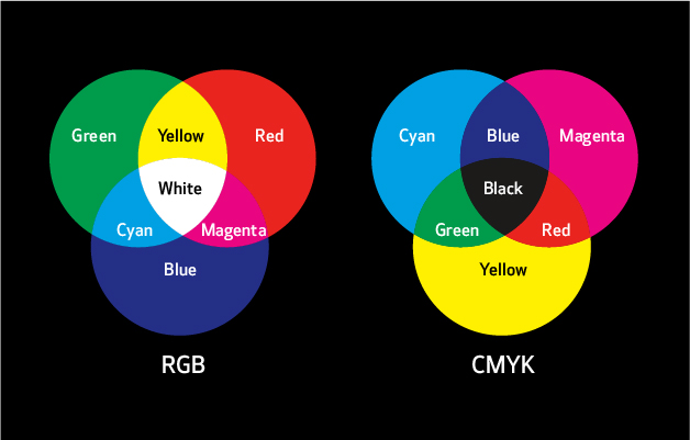
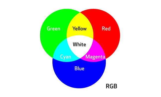
Computer monitors inhabit the RGB color space, or gamut, because they project colors using red, green, and blue light. RGB can be described as “additive” color because it’s created with light—the more light that’s added, the lighter and brighter the colors become. For example, if you intersect a red circle and a blue circle on a monitor, you’ll see a bright magenta. If you intersect red, green, and blue circles, you’ll see white at the center.
Source: The Designer’s Guide to Inkjet, 2nd Edition, by Elizabeth Gooding and Mary Schilling, Canon Solutions America
While color accuracy from one digital display to another should be close to consistent, there is variation. According to The Designer’s Guide to Inkjet by Elizabeth Gooding and Mary Schilling, to be certain you’re seeing a fairly accurate color representation, you should calibrate your monitor regularly (at least once a week).
CMYK World
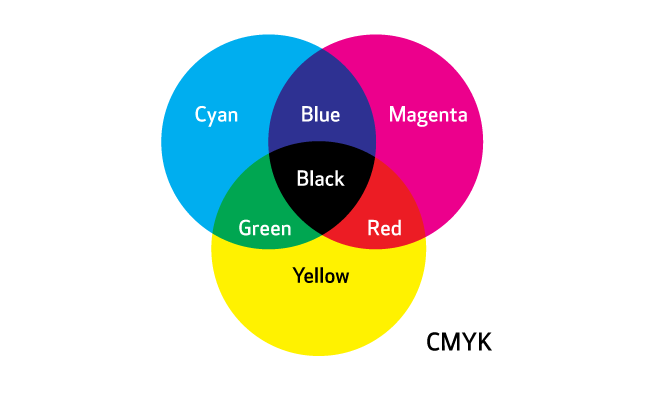
On the other hand, the CMYK color space uses “subtractive” color. CMYK inks filter whatever light is in the environment and reflect it back off the printed page, so it can only create a limited number of colors—in other words, CMYK has a much smaller gamut than RGB. If you mix cyan, magenta, and yellow inks together on paper, you get dark brown where they meet in the middle. Hence the need for the addition of “key,” or black, ink. (There’s even a rich black that can be produced by adding small percentages of cyan, magenta, and yellow to regular black ink).
Source: The Designer’s Guide to Inkjet, 2nd Edition, by Elizabeth Gooding and Mary Schilling, Canon Solutions America
Color Matching in the Real World
So what does that mean in the real world? Brands, for example, want to reproduce their logos on everything from letterhead to labels—exactly. Imagine how you might balk at buying your favorite brand of candy bar if the logo suddenly appeared dingy or in a different color, right? And that’s just one area where color matching is crucial. So, how do you reconcile the differences between RGB and CMYK?
Source: The Designer’s Guide to Inkjet, 2nd Edition, by Elizabeth Gooding and Mary Schilling, Canon Solutions America
We asked our senior designer, Chris Gach, for some pointers based on his experience and process.
Illustrator: “If you’re working in Illustrator, everything automatically appears in RGB mode, so you’ll have to switch to CMYK mode,” said Chris. “You still might not get a perfect match between what you see on your screen and the final printed product, but it will be a lot closer. And be especially careful when trying to reproduce those eye-catching Pantone colors. There are more than a thousand that just can’t be created precisely with CMYK. You’ll need to try to find the next closest match.”
Then he added a couple more caveats. “This mode dulls images, so you’ll have to adjust them. You should also make sure your images are 300 dpi and saved as TIFF files for the best image quality. And if you can, quality-check printed materials in a color-neutral D50 light booth that simulates ‘warm daylight,’ or look at them outdoors to ensure they look how they should.”
InDesign: If Chris works in InDesign as part of a job, he uses Package Files for a prepress review. “It’ll let you do a color profile where you can choose CMYK. But be sure to check with your print vendor before changing anything—some prefer you to leave files in RGB mode so they can make their own adjustments.”
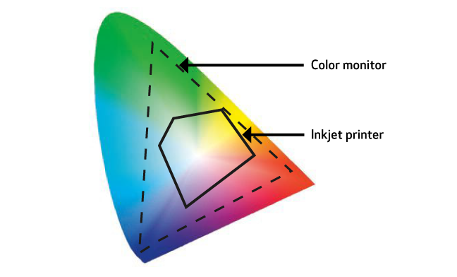
Either way, checking with your print service advisor in advance is always a good idea. Different types of production printing equipment can accommodate different color gamuts. For a while, production inkjet always had a smaller color gamut than offset, but this is quickly changing. The recent creation of expanded gamut (XCMYK) for production inkjet printing and the addition of fifth colors such as orange, green, violet, and even fluorescent pink are opening up colorful new possibilities. The type of ink (dye, pigment, UV, waterless, or hybrid) isn’t the only thing that makes a difference—so does the type of paper. For example, coated or treated inkjet paper actually results in a larger gamut than uncoated offset paper.
Can We Color Your World?
When you consider all these variables, color conversion between digital (RGB) and printed (CMYK) materials seems even trickier. But getting it right makes all the difference. Fortunately, it’s a skill our creative, savvy design team has definitely mastered. If you’re looking for compelling printed communications or dynamic digital content, we can help make RGB and CMYK as easy as ABC!
