Every year, thousands of products and services are launched into the market with high hopes and smart strategies—yet so many gain limited traction. Scrutinize those shortcomings, and you’ll often find a core culprit: brand design that’s not doing its job.
SLS has built integrated marketing and design campaigns for brands at every stage of growth, and I’m convinced there’s one consistent truth: Design is not decoration; it is strategy made visible. The visual identity of a brand entering the market is your first chance to earn trust and communicate value. It should make someone stop scrolling.
What separates a brand launch that lands from one that gets lost in the fog of unremarkable sameness? These fundamentals always apply:
1. Brand design is a system, not a single element.
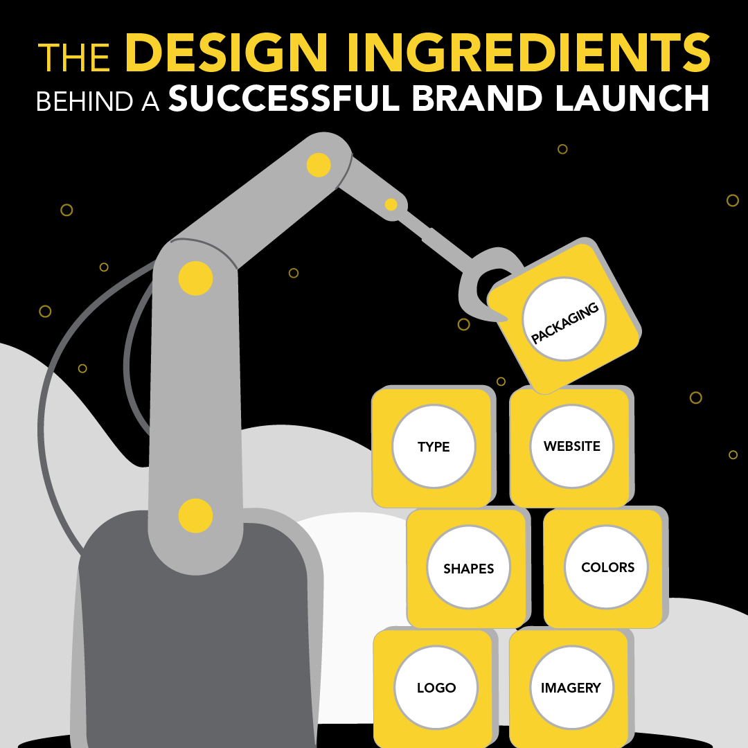
Don’t treat the logo as the brand. While an eye-catching logo is important, it’s a point of departure, not a destination. Brand design constitutes a full ecosystem of visual elements that work in harmony to tell a strong story. That system includes:
- Logo — the anchor of your identity, built for recognition across every size and surface
- Imagery — the photographic and illustrative language that shapes how your brand feels
- Shapes — geometric and organic forms that create visual personality and structure
- Color palette — the emotional and psychological shorthand your audience will come to associate with the brand
- Typography — the voice of your brand in text form, communicating tone before a single word is read, playing an essential role highlighting key takeaways and calls to action
- Website — the digital home where all elements unite and your story is fully revealed
- Packaging — where design meets the real world; the primary physical brand touchpoint
When one of these elements is out of step with the others, the brand experience breaks down. Customers feel it, even if they can’t articulate why. Think about the incongruity you felt when a familiar brand made a clumsy transition to a new look and feel. Jaguar lost its pouncing feline, Tropicana muted its tropical flair, Twitter became the antiseptic and indistinct X—all classic examples of rebranding that curiously detached from that brand’s original identifying power.
Our job as designers and brand strategists is to make sure every piece preserves impact that speaks to a complete identity.
2. Design decisions are driven by core principles.
Having the right building blocks is only the beginning. The thinking behind how you use them is what elevates a brand from merely functional to genuinely memorable.
Here are the principles I return to again and again when leading a brand launch:
Clean. Clutter is the enemy of trust. A clean design signals confidence and professionalism. When a brand tries to say everything, it communicates nothing. Edit ruthlessly. Less is more.
Consistent. Consistency builds recognition, and recognition builds trust. Every touchpoint, from a social post to a tradeshow booth to an email signature, should feel unmistakably like the same brand.
Fresh. There’s a real danger in defaulting to what’s familiar in your category. The most impactful brand launches bring something unexpected to the visual landscape: a color that breaks convention, an unexpected typographic choice, imagery that captures attention and invites conversation.
Flexible. A brand lives across dozens of contexts. A logo that only works at a certain size, or a color palette that disappears on digital screens, signals a brand that will struggle. Great design systems are built to stretch.
Relevant. This seems obvious, but it’s often overlooked. Design decisions must connect to the brand’s industry, audience, and competitive environment. Beauty for its own sake isn’t enough. The design must fit the world the brand inhabits; it must reflect the core values of the company itself.
Resonant. Beyond relevance is resonance, the quality that makes someone feel something when they encounter your brand. Resonance comes from knowing your audience deeply enough to speak to what they value, aspire to, and believe in.
Authentic. In a world drowning in over-polished content, audiences have developed finely tuned radar for what’s real. The most enduring brand designs embody a company’s purpose and culture, not trend reports. Compare Coke’s unfailing adherence to its “dynamic ribbon” and script (in use since 1946!) to Pepsi’s curious move toward minimalism in 2009 and return to evoking its 1960s origins two years ago. If the former is “the real thing,” the latter might be “the confused thing”?
Audience-focused. Ultimately, brand design is not self-expression. It’s a conversation with the people you’re trying to reach. The most important question isn’t “Do we love it?” It’s “Will they love it?”
3. Do the work behind the work.
Building a brand that gets all of this right requires deep collaboration among designers, strategists, copywriters, and the client teams who know their business inside and out. It requires research, ideation, iteration, in-depth conversation, and honest critique.
At its best, brand design is the result of a clear purpose, identifying what the brand stands for, who it serves, and why that matters. All of this should be expressed through visual language that is both strategically sound and emotionally compelling. That integration gets attention. It might start with a beautiful logo, but that initial impression needs to anchor a cohesive, intentional design ecosystem that earns trust and drives growth.
Get that right, and the brand doesn’t just look good. It works.
